
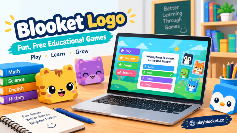
A good educational platform does not always need to look serious. Sometimes, a bright and playful identity can make learning feel more approachable. That idea fits Blooket particularly well. Designed around interactive games and classroom learning, Blooket gives students a different way to practice questions, compete with classmates, and stay involved during lessons.
One of the first things people notice when they discover the platform is the blooket logo. Its simple, friendly appearance matches the personality of the website, where learning and entertainment are intentionally brought together.
What Is Blooket?
Blooket is an online game-based learning platform built for educational activities. Teachers can select an existing question set or create their own, then use it in a live game or assign activities for students to complete asynchronously.
The concept is straightforward: instead of presenting every review activity as a traditional quiz, Blooket places questions inside different game experiences. This gives students another reason to participate and can turn routine practice into something more interactive.
Blooket also offers a large collection of user-created question sets, allowing educators to search for material based on subjects, topics, grade levels, and skills.
Why the Blooket Logo Stands Out
A logo does more than identify a website. It can establish the mood people associate with a brand.
The blooket logo has a playful character that works naturally with the platform’s overall concept. Blooket is aimed at making educational activities feel less formal, so a highly corporate-looking logo would not communicate the same personality.
Instead, the visual identity feels connected to the colorful world of Blooks and game-based learning. The platform itself describes Blooks as small, collectible creatures that students can use during games, giving the service a recognizable visual theme beyond its name.
The Typeface Behind the Identity
The Blooket logo is associated with Titan One, a typeface designed by Rodrigo Fuenzalida. The heavy, rounded character of this typeface contributes to the logo’s approachable appearance.
Typography can have a surprisingly strong effect on how a name feels. Thin lettering may appear formal or sophisticated, while heavier rounded lettering can feel energetic and friendly. For an educational gaming platform, the latter approach makes sense because it supports the playful atmosphere students experience while using the service.
The logo therefore works as more than simple text. Its typography helps reinforce the idea that Blooket is a learning platform designed to be enjoyed.
More Than a Logo
Although the blooket logo can be an easy visual identifier, the platform’s identity comes from the entire experience.
Students can join live games using a game code, QR code, or shared link, and they can select a Blook while waiting for the activity to begin. A student account is not necessarily required to join a teacher-hosted game.
This simple joining process is part of what makes the service convenient for classroom use. Teachers can organize an activity while students participate from their own devices.
How Blooket Combines Learning and Games
Blooket’s approach is based on putting educational questions into game environments. A teacher can start with a question set and select an available game mode. Students then answer questions while progressing through the chosen activity.
The official platform highlights three basic stages: getting a question set, choosing a game mode, and then playing and analyzing the results.
That structure gives teachers flexibility while keeping the student experience more engaging than a conventional worksheet.
Why Visual Branding Matters in Education
Educational technology has become increasingly visual. Students interact with websites, games, dashboards, characters, icons, and other digital elements throughout the learning process.
In this environment, branding can influence first impressions. A friendly logo can immediately communicate that a platform is intended to be approachable rather than intimidating.
The blooket logo fits this role by connecting the name of the platform with its colorful and game-focused personality. It becomes a small but recognizable part of the larger experience.
Blooket’s Growing Identity
Blooket is not limited to a single classroom activity. Its official platform includes question sets, multiple game modes, reporting features, collectible Blooks, and tools for educators.
This broader ecosystem gives the brand more opportunities to use a consistent visual identity. From the main website to game screens and Blook characters, the platform maintains a recognizable style centered on fun and participation.
Final Thoughts
The blooket logo may look simple at first glance, but it fits an important purpose. Its bold and friendly typography supports the personality of a platform that wants educational practice to feel more like play.
Blooket’s identity is ultimately bigger than its logo. The combination of interactive games, question sets, collectible characters, and classroom tools creates an environment where students can learn while taking part in competitive and entertaining activities.
That balance between education and fun is what makes Blooket recognizable—and the logo is one of the visual details that helps communicate that idea from the moment users see the brand.
